

For years now, I’ve been using the metaphor of the O&G Venn Diagram of Doom.
A typical E&P company owns dozens of pieces of software, sometimes even hundreds. The longer a company exists, the more likely that it has accumulated software with heavily overlapping feature sets.
I love this metaphor because everyone loves a good Venn Diagram. They can clarify, educate, and even make me laugh out loud (my sense of humor is….specific).
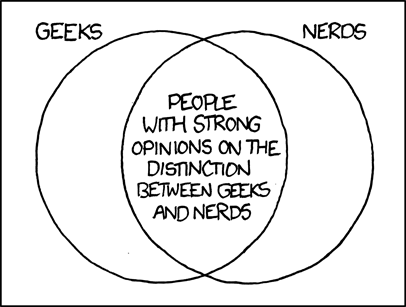
Credit: xkcd.com, the best geeky webcomic around.
But the Venn Diagram of Doom for O&G technology costs real money – not just software licensing, but even more in terms of soft costs:
- Data loading, integration, and synchronization
- User training, IT maintenance and support, and upgrade management
- Worst of all – endless arguments about which system is “right” or “best”
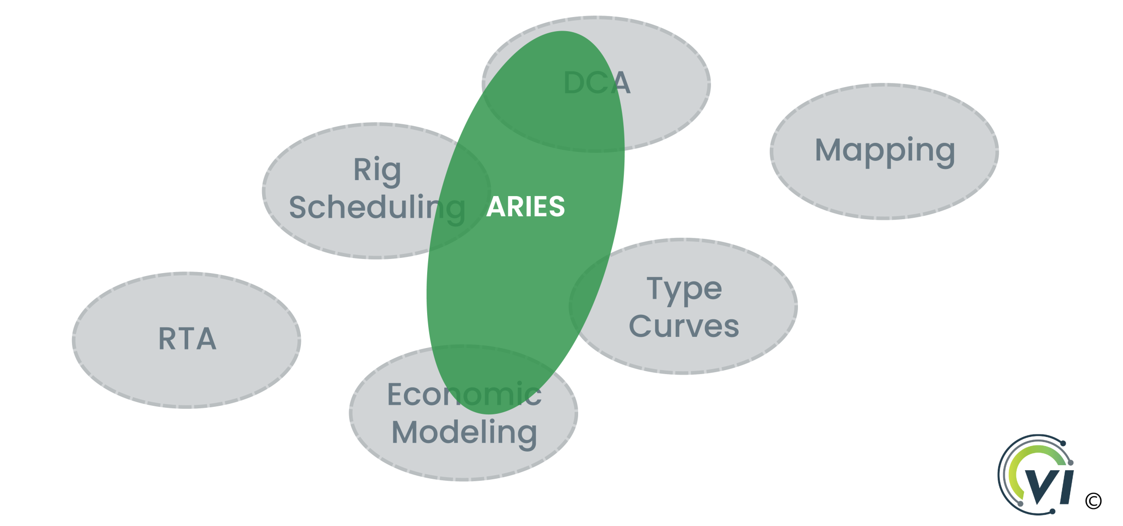
An example from a world I’ve spent most of my career in – reserves and planning.
Let’s say I have some Upstream oil & gas assets and need to run reserves and A&D workflows. We choose ARIES, the industry’s most common tool for working with lenders, reserves auditors, and investment banks. I do some decline curve analysis, build a drilling schedule, and run economics. Success!
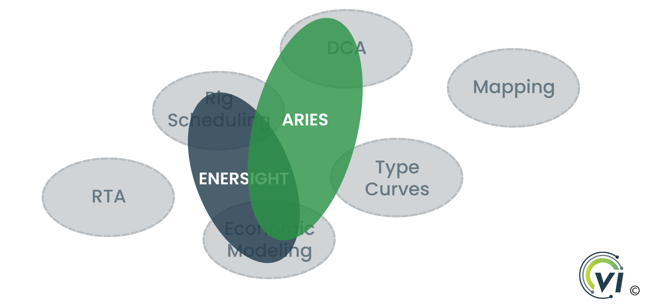
But the next month, parent-child effect rears its ugly head. It’s time to model offset well frac bashes, and I’ve been running a million spreadsheets to model rig schedule sensitivities, so I pick up an Enersight license. We build out some better schedules, start forecasting frac hits within 1/4 mile, and build out some nice logic around cost forecasting. Success, again!
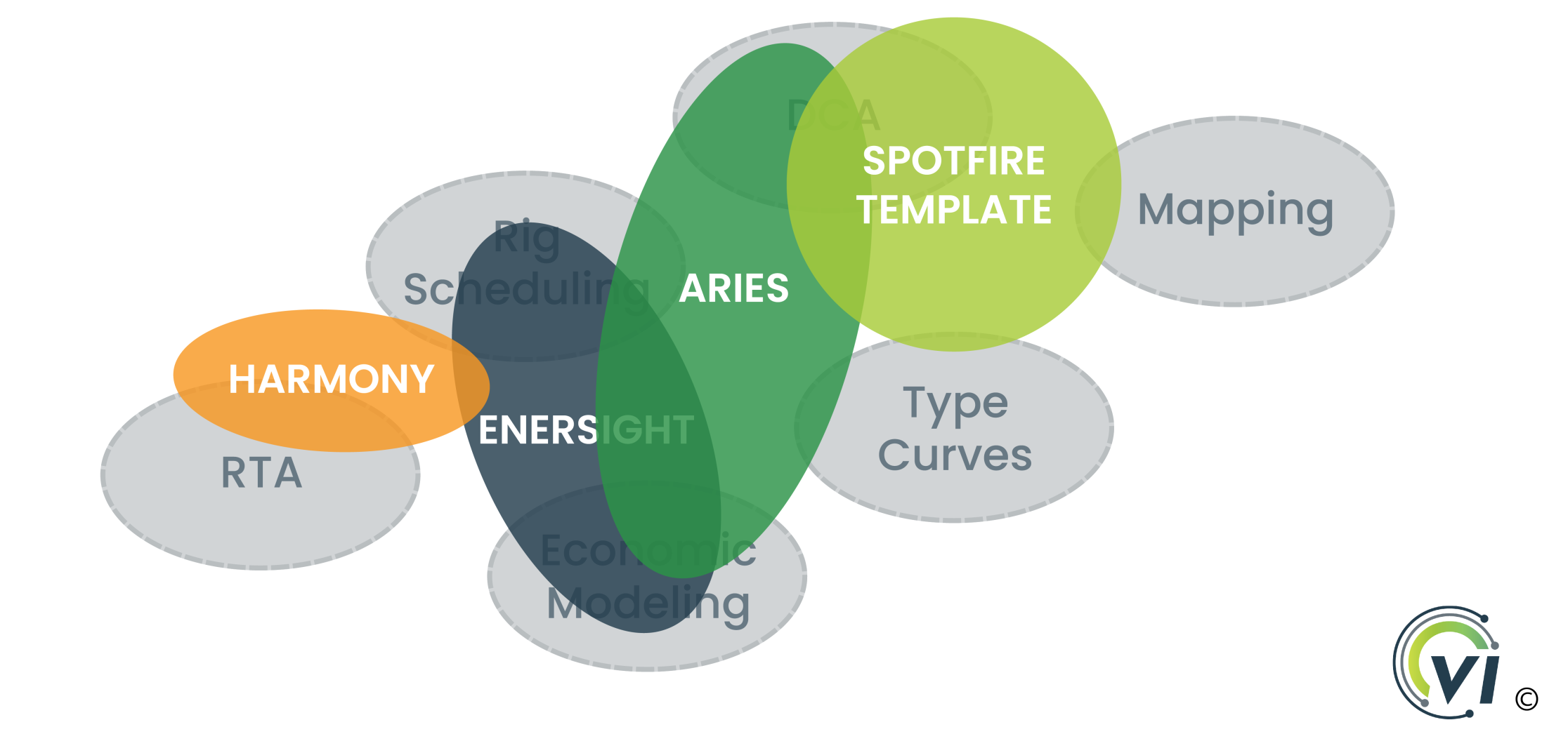
But wait! The month after that, I realize I need to start doing Rate Transient Analysis for my early-time wells, so I pick up a license to Harmony. And our type curve process gets more complicated as we bring in more data, so I build a fancy Spotfire project to help with integrating some new geologic maps into our type curves. Two more tools, and our Venn Diagram of Doom is really starting to take shape!
This is just a microcosm – every discipline in an O&G function faces similar dynamics. Eventually, you’ll end up with 5 applications with GIS capabilities and 8 apps that can do production surveillance. This is a key root cause of software proliferation, the ugly truth of how an E&P can end up with TWO HUNDRED separate pieces of software to pay for, implement, and maintain (yes really, we know of a company that owned two hundred apps).
So what does this mean for E&Ps?
As we wrote in our blog on Displacers and Augmenters, we think of E&P software occupying “technology slots”. These slots are pretty common across most E&Ps, whether it’s one of the Big Six (the most central pieces of software at an E&P) or the Distant Dozen (those discipline-specific tools that drive productivity all around the business). If you’re either adding or removing tools, you need to keep in mind how they are changing the shape of your Venn Diagram.
As an E&P builds technical debt and inertia over the years, the Venn Diagram of Doom makes innovation harder and harder. Those dozens of apps each have a loyal user base, and the idea of switching to a New Thing frankly sucks. Those loyal users fear losing productivity, status as a Power User, and even turf. Worse yet, if the New Thing occupies a larger footprint on the Venn Diagram of Doom, you’ll have multiple sets of loyal users that you’ll have to persuade. The financial (and political) costs of switching skyrocket – software demos, meetings to rank options, etc. The implementation may exhaust the team before the benefits can be realized!
This can be overcome – you’ve got to start by drawing your Venn Diagram. Build a coherent list of business needs, map out your existing capabilities, and do the work to match them up. If tools need to be cut loose, take the time to build alignment before cancelling the contract. And before you sign up for the New Thing, have a clear understanding of whether it’s Augmenting or Displacing. If everyone’s aligned on the business reason that someone took away their Favorite Tool or added yet another Source of Truth, things will go better.
And what does this mean for Software Vendors?
I haven’t ever worked for a software vendor, but I suspect this is an essential thing to understand if you’re selling software to E&Ps. If you’re trying to displace something with a tool that occupies a different footprint on the Venn Diagram of Doom, it’s that much harder. Stay in your lane or expand slightly, and it’s an easier sell. And worse, if you can’t fully replicate the incumbent in a Technology Slot, your customers will have a hard time with the value proposition, since they may not be able to actually deprecate the incumbent.
We hope this framework is a helpful way to think about your current tech stack – we love helping companies navigate their own Venn Diagrams to find realistic, cost-effective ways to either expand their digital capabilities or rationalize their tech stacks.